I first heard of Jan Plecháč and Henry Wielgus through their design collaborations with Danish brand Menu. Stumbling across one of their residential projects yesterday, I ended up on their website and was really excited to find more examples of their work. The pair met during their studies at The Academy of Art, Architecture and Design in Prague and started their Czech-based studio in 2011. Their work has been exhibited at renowned international galleries and they have collaborated not only with Menu, but brands such as Rossana Orlandi Gallery, Mint shop, Luminaire and Cappellini.
![]()
![]()
![]()
![]()
![]()
![]() Photography by Martin Chum
Photography by Martin Chum
The home features some of Jan and Henry's designs including the Ondulé collection for Limited Production shown below, which includes a coffee table and clever mirror/shelf design which you can see here.
![]()
![]() Photo by Martin Chum
Photo by Martin Chum
![]() Photo by Martin Chum
Photo by Martin Chum
One of their new designs, Balance of Beauty is a mirror that like an hourglass, is loaded with sand allowing a rolling motion that enables it to be set at the right angle. Elegant and airy, the collection consists of a series of three different sized objects which beautifully complement one another.
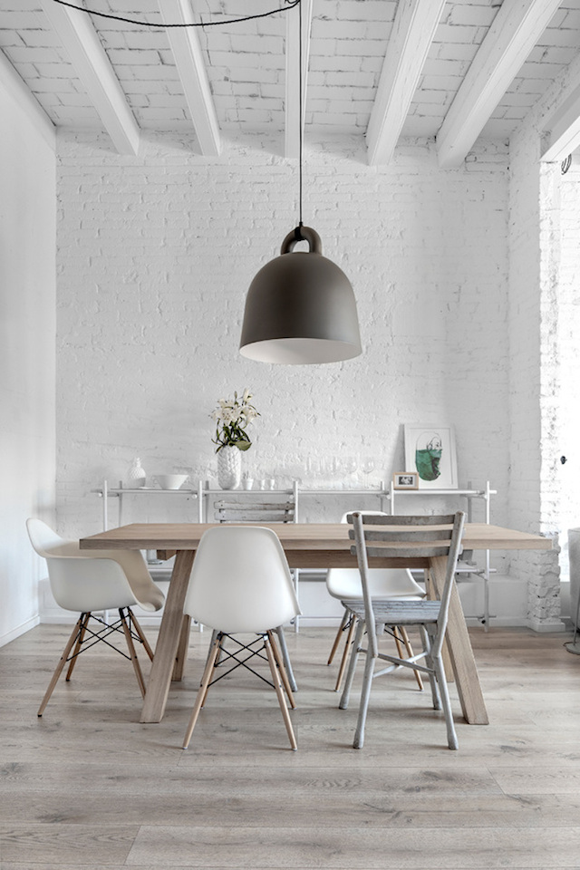
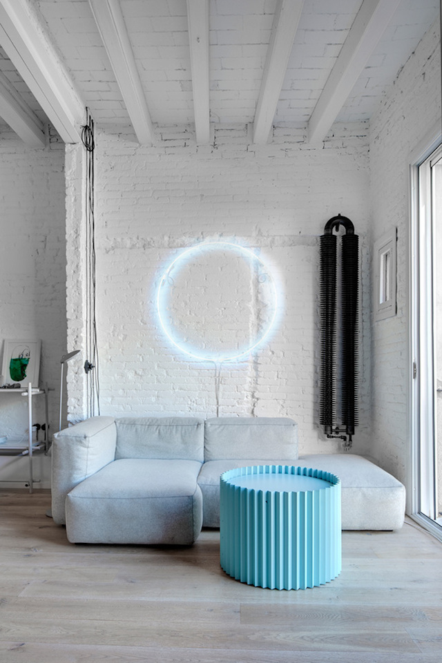

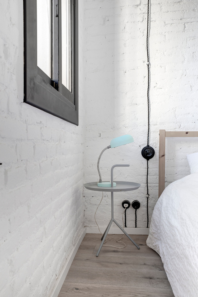
This Barcelona apartment by Jan and Henry gives you a real sense of their style and aesthetic. The spaces are understated, allowing the bright pops of colour and oversized lighting to stand out. The painted brick walls and ceiling beams give a sense of history to the interior, adding texture and interest.
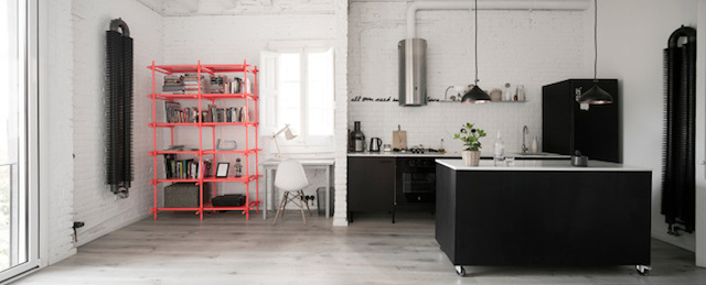
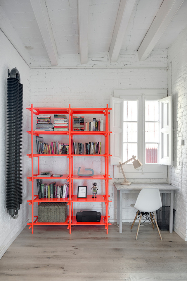
The home features some of Jan and Henry's designs including the Ondulé collection for Limited Production shown below, which includes a coffee table and clever mirror/shelf design which you can see here.


Maximum simplicity and variability were the key factors in the development of the Stick System designed for Menu. Created with the younger generation in mind, the unique series allows the formation of a work table, a hanging clothing rack, a floor lamp, and a shelving system that can be arbitrarily extended and adapted to the space. Last month, it was awarded best furniture in the Elle Deco International Awards, with the pair also taking out Designer of the Year.
![]() Photo by Kristina Hrabetova
Photo by Kristina Hrabetova
My Spot, also designed for Menu draws inspiration from the legendary Bauhaus school. Playing with gravity, minimalistic shape of circle, composition and colour accent, it consists of three anchors, a weight and black string, from which to hang a calendar, message, sketch, postal order, hotel reservation or a postcard from travel.

One of their new designs, Balance of Beauty is a mirror that like an hourglass, is loaded with sand allowing a rolling motion that enables it to be set at the right angle. Elegant and airy, the collection consists of a series of three different sized objects which beautifully complement one another.
![]()
![]() Photo by Martin Chum
Photo by Martin Chum
Images via Jan Plecháč and Henry Wielgus


