November 24, 2014, 1:49 pm
Following on from last week's post, where I introduced you to the new luxury range of Sanctuary beds from Sleepyhead, I had the pleasure of styling one to share with you today.
To create a luxurious yet relaxed feel, in fitting with exceptional quality and innovative design of Sanctuary, I chose beautiful linen bedding by bedouin SOCIETE from Indie Home Collective. The exquisite silk pillowcases, cushions and throw are by NZ designers Penney + Bennett who I introduced you to in this post. An iconic Grasshopper Lamp by Gubi and accessories from my favourite Danish brand Menu completed the look.
Details:Le Mans Queen Size Sanctuary Bed by Sleepyheadbedouin SOCIETE Linen duvet cover in Stone, sheets and pillowslips in White and Khol Black, all from Indie Home CollectiveIn celebration of the launch, Sleepyhead are running a competition via their Facebook Page, but get in quick as you only have a few days left to enter! The winner will win a bedroom design consultation with me, plus $1,000 to spend on a new bedroom. Pop over here to see how to enter. The competition ends 30th November 2014. Styling and Photography by Michelle Halford for T.D.CThis is a sponsored post. For more information on sponsored posts, please take a look at my About Page.
↧
November 25, 2014, 2:47 pm
The kitchen is certainly the heart of the home in this gorgeous Stockholm apartment. Recently renovated, I love the mix of dark and light grey cabinetry, gold handles, Carrara marble benchtop and industrial style. If you're ever in a position to consider knocking some walls out to create more of an open-plan kitchen/dining area, this is great inspiration! Original details including the high ceilings and beautiful big windows further enhance the airy, light-filled space.
Grey and gold accents continue throughout the home, along with oodles of charm and character. Contrasting sofas in well worn black leather and fresh white look equally appealing, while black and white framed prints and photography add the perfect finishing touch.
I'm always happy to see exposed bricks retained, even if it's just a glimpse! The industrial wall lamp and the glass cluster pendant light from House Doctor in the bedroom also make my heart sing! See the full house tour here.
Images via Entrance Makleri
↧
↧
November 26, 2014, 3:57 pm
From my early days of blogging I have been following the Father Rabbit journey, and watching in admiration as the NZ-based brand has grown from strength to strength. First launching their online store in 2010 and now with two Auckland retail stores under their belt, owners Claudia Zinzan and Nick Hutchinson have always remained true to the Father Rabbit ethos. Using a discerning eye and consistently searching out products that fit with the brand's core values has been integral to their success, and even more so as the market becomes increasingly noisy and crowded.
I recently caught up with Claudia to take a little look behind the scenes. From her first moodboard developed several months ago, through to the instore realisation of the concept, Claudia kindly tells us how Father Rabbit's beautiful Summer edit for 2014 came about. Father Rabbit Summer 2014 Moodboard
Let's start at the beginning. How did you go about selecting products for the season?
As a direct result of being immersed in social media and now having a bigger store (at BLOC) I have many product choices on my horizon, and receive lots of emails from beautiful brands. As such, I have had to be more selective within our Father Rabbit aesthetic. We've also sensed that we need to have a new or seasonal offering that works alongside our basics ranges, to help remain one of the leaders in the home wares offering in NZ. This a lovely challenge for me as a creative and helps me formulate a mood or palette for the season. It's really just a simple touch to my buying to make it as narrow-minded as possible, so that all the different ranges and brands are harmonious within the physical space.
Were there any standout products that served as a starting point for your Summer Curation?
I go along with some serious gut feelings about a direction and I usually have a deal-breaker key product that is so amazing, I can't not have it in Father Rabbit. This latest season it was the Basil Bangs Black and White Stripe Beach Umbrella and the Erstwhile Prints. I was also working with our selection of Christmas Decorations from Denmark that I had ordered months and months before, so I had to select products that filled the gap to create harmony among our signature brands that we carry.![]()
The one below has a heavy nautical theme with sail boats and stripes, while the other one (at the top of the post) has lots of dark green botanicals, black and white stripes and geometric simple patterns. These moodboards correlate to different parts of the space. I really wanted a summer feel to the store, but was also aware of our Christmas theme. Often the two can clash in look, so I was very restrained with our Christmas palette... all red was banned.![]()
Father Rabbit Nautical Moodboard
How did the collaboration with Boards by Blank come about?
At the same time as working on our Summer look I discovered my friend Jon Chapman Smith was on the sly setting up a boutique custom surfboard brand called Boards by Blank. They were just so understated and different, I had to work them into the store somehow, so we did a custom Father Rabbit design which features white with a black dip. Then he told me he was making these super well-crafted day bags aimed at people like him. Made in NZ from canvas and leather, they are not only incredibly functional they feature one of my signature colours of the season, bottle green. So that was perfect timing.![]()
Father Rabbit Summer 2014 realised in store
What's next for Father Rabbit?
We will soon have the next season moodboards for 2015 coming into effect, so they must also have harmony with previous seasons. We don't suddenly ship everything out of the shop each season to start a fresh, so they all need to talk to each other in some way.
As a brand we have grown up a bit and we are now in a position to develop our own products. That is the most exciting part of this journey.Father Rabbit Summer Nautical Theme realised in storeHuge thanks to Claudia for sharing so much with us today. For store locations or to shop online, pop over here. Images courtesy of Father Rabbit
↧
November 27, 2014, 4:13 pm
As November draws to a close, I thought I had better squeeze in an Instagram post for the month. It also gives me a chance to say a massive thank you to all my followers out there. Knowing that you are gaining inspiration from my daily posts gives me the encouragement to keep going, even on those days when I'm struggling to pick up the camera, or the house looks like a complete tip. Despite how it may appear, ours is very much a lived-in family home and what you see is the edited version, when the scattered toys have been swept out of view. This week has been the most challenging yet, because our youngest son Marlow managed to cause a flood downstairs when he decided to run a bath while I was upstairs cooking dinner. Four days of dryers and dehumidifiers going has caused the house to become like a sauna, and my brain also feels completely fried. A mention of this little disaster on Instagram resulted in some lovely (and amusing) comments, which immediately made me feel better. Especially the story from a fellow Mum whose son (also four at the time) put the hose through the living room window to make a 'swimming pool'.![]()
↧
November 30, 2014, 4:55 pm
A few weeks ago I wrote this post, featuring the gorgeous dark blue tones that we've been seeing a lot of lately. It's no secret I love adding green to interiors, in all shades of light and dark (especially when it comes to plants), but much like blue, I've recently been drawn to the darker variety. Deep blues and greens work beautifully together, (remember this gorgeous Superette Scarf) and of course they go hand in hand with a monochrome palette. For something new, try pairing dark green with softer shades of blush and grey. Covering all bases, here are some examples to demonstrate. Beautiful styling by Annaleena Leino for BlOOC
A tiled splashback adds texture and a pop of colour. Featured in The Apartment, Copenhagen, photographed by Daniella Witte
An unexpected yet lovely combo of mint, dark green and blush, styled by Sofie Lawett and Caroline Richter, photo by Marcus Lawett for Elle Decoration
Some of my product picks to inspire you further, the rug by Danish design house &Tradition is a standout. Non-Objective Composition #2 by Playtype from The Poster ClubMuuto Visu Lounge ChairNew Balance M576 ShoesMuuto Match Tealight Holder&Tradition Another RugNormann Copenhagen Pocket Organisers
↧
↧
December 1, 2014, 7:36 pm
Known for their beautiful, luxurious and unique New Zealand made bed linen, Thread Design is well-loved here at T.D.C, and has been featured several times. With an ongoing focus to expand their range of brands, the company has more on offer than ever before. Owners Katie Collis and Sarah Sadgrove do an amazing job of constantly sourcing beautiful home accessories and furniture to sit alongside the Thread Design collections, in both their Grey Lynn retail space and online store.Just in time for Christmas, I'm thrilled to announce the arrival of their latest collection Clearwater. Made from 100% linen, the gentle and calming pallet of slate, duck egg blue and natural evokes a feeling of restful luxury and warm summers at the waters edge. In other words, pure bliss! The two toned duvet and metallic printed cushions in copper, gold and silver add a unique twist and touch of glam.
Perfectly complimenting the new and staple linen ranges, the Thread Design retail store offers a beautifully curated collection of furniture, ceramics, lighting, fashion, beauty products, art, linen and more. A key element, and one that is really important to Katie and Sarah is to support NZ-made. As such, you will find many local designers such as Tim Webber, Basement, Ashley & Co, Mandy Barker, and Studio Ceramics.
Visit Thread Design at 274a Richmond Road, Grey Lynn, or shop online.Photography by Karen Ishiguro, courtesy of Thread Design
↧
December 2, 2014, 12:34 pm
Halfway through last year I wrote a post on Vee Speers, an Australian born artist living in Paris, whose works have been widely exhibited and published around the world. I was captivated by her incredible collection of portraits, having seen several of them appearing in the beautiful Scandinavian interiors that I love and admire. Part of a series by Vee called The Birthday Party, the artworks were inspired by her daughter's birthday party and the dressing up that went along with it. With a beautiful, dream-like quality, they each tell a different story, drawing you into a world that sits somewhere between fantasy and reality. ![]()
![]()
Having struck a chord with so many people around the world, I wasn't surprised to hear from my readers wanting to buy the prints here in New Zealand and Australia. One such team was Natalie Wheeler and Kristy Sadlier of the Australian homeware store Norsu, who after reading my post fell in love with the artworks. Determined to bring them to our shores, they set out on a mission to do just that. Met with several major obstacles along the way, their hard work and persistence has paid off, and they are now the proud stockists of Vee Speers posters in Australia. Not only that, they have acquired the rights to sell them internationally!
![]()
![]()
Purchase your poster now at Norsu online, or if you are in Melbourne, visit their gorgeous new store located at 356 Wattletree Road, Malvern East Vic. Nat and Kristy would love to meet you! Beautiful imagery styled by Norsu and photographed by Prue McMillan
↧
December 3, 2014, 2:57 pm
I had my first glimpse of this apartment some time ago when I saw a photo of the incredible marble and gold bathroom. Of course I had to find out more. Part of a renovation project by Studiomama, the two loft apartments were once derelict office spaces on the top floors of a 300 year old building in Stockholm. Transformed into beautiful modern living spaces that remain sensitive to their historic surroundings, the original framework and exposed wooden beams help punctuate the open space and retain the sense of charm. Now for sale, I love how the team at Fantastic Frank have applied a very pared-back uncluttered style, allowing the beautiful timber, Carrara marble and gold elements to shine.
I immediately recognised the Dinesen Douglas Fir floorboards (as featured here) being that they were the inspiration for our home, but this is the first time I've seen them used beyond the purpose of flooring. The unique and seamless continuation which forms a wall of storage and kitchen island is quite remarkable. The wall hides the kitchen cabinets and doors to the bathroom/sauna and bedroom.
The design is simple, but the materials and double height gives a sense of grandeur, with every detail having been meticulously thought out. I love the addition of skylights and built in shelves. The Alvar Aalto Second Nature book also happens to be on my wishlist
.
Images via Fantastic Frank
↧
December 7, 2014, 1:56 pm
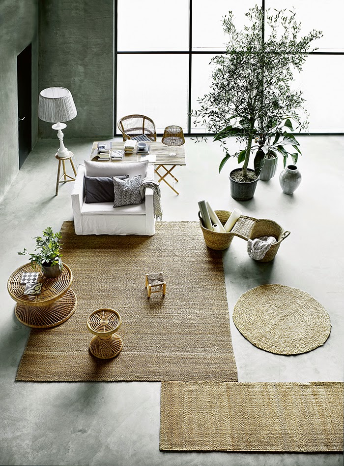
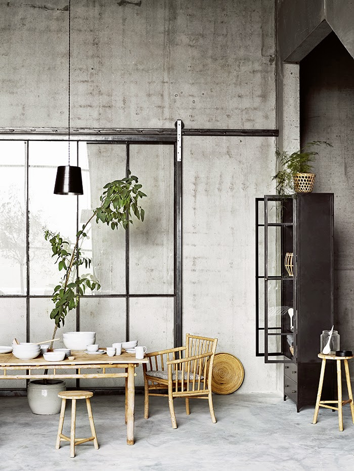
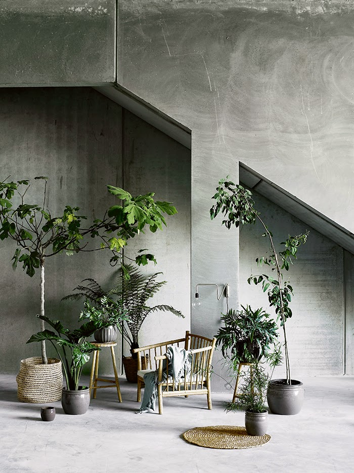
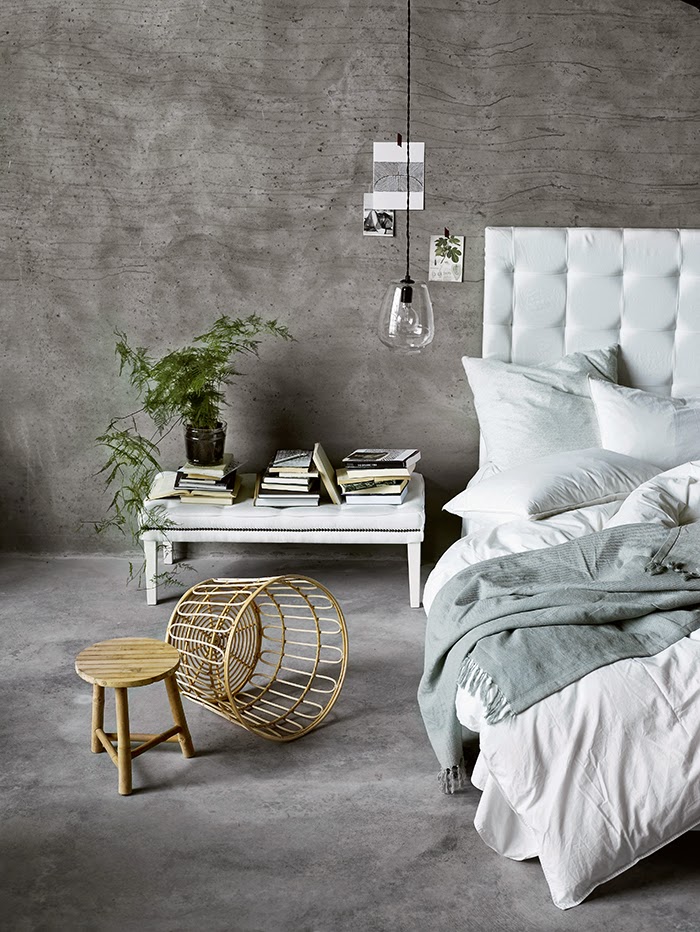
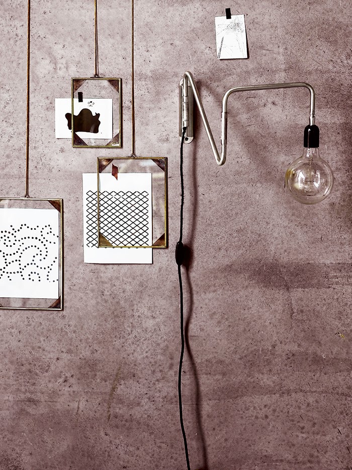
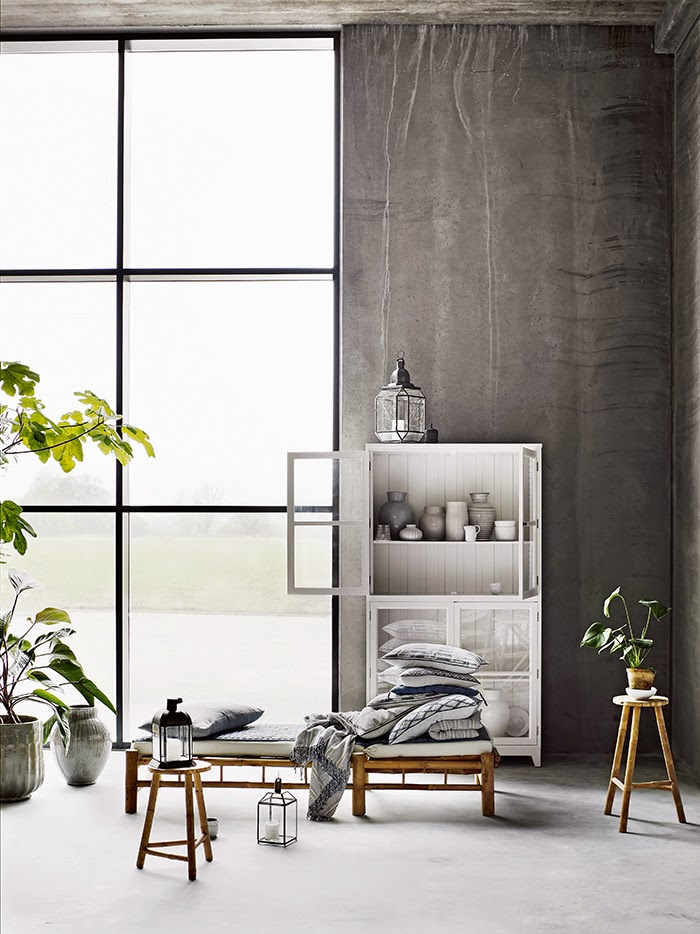
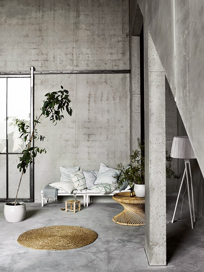
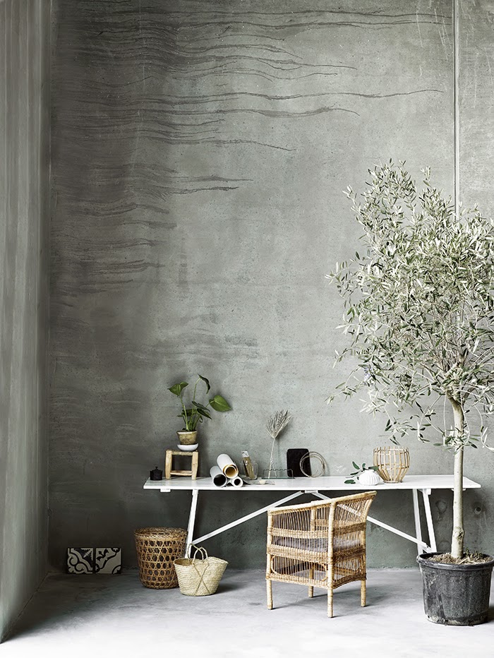
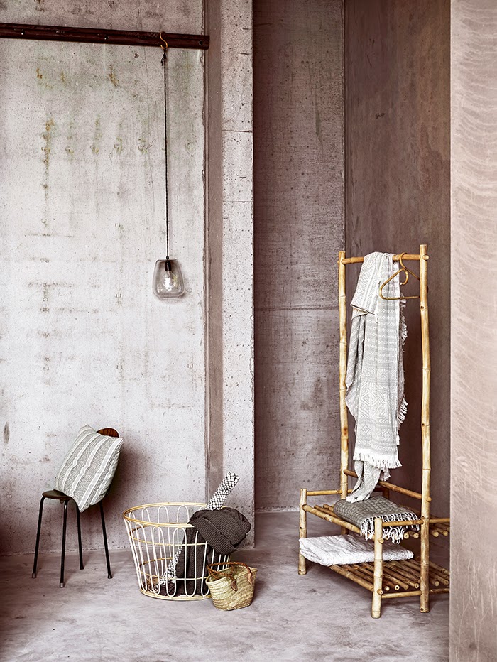
I was just thinking last week that it must be time to revisit concrete here on the blog. It's a material I love seeing used in interiors and judging by the positive response I received to this post last year, many of you feel the same. My prayers were answered this morning when I discovered the new Spring/Summer 2015 catalogue from Danish homewares brand Tine K Home. The beautiful new range has been styled against a glorious backdrop of textural concrete. Providing the perfect contrast for the wicker and wood, it also looks amazing against the soft muted colours and lush green plants. See the entire catalogue here. Images via Tine K Home
↧
↧
December 8, 2014, 1:03 pm
When Dulux announces their colour trends for the following year, you certainly sit up and take note. Having had the pleasure of seeing a preview of the Dulux 2015 forecast at a recent launch, I was blown away, not only by the stunning colour ranges, but also the incredible styling and imagery. In developing the four colour trends, Dulux drew on inspiration from global creative industries, such as art, fashion and interior design. This year's theme is Connection, explained here by NZ Dulux in-house colour expert Louise McKenzie-Smith.
"Continual connectivity through technology has reinforced our basic human desire to connect in the real world. Connect with the earth by feeling the soil between our fingers, connect with ourselves by taking time to pause, connect with our heritage by relearning forgotten skills, connect with our playful side by indulging in colour."
To bring the vision of Connection to life, Dulux collaborated with six inspiring design experts including Edwards Moore, Bree Leech and Heather Nette King and Bonnie and Neil.![]()
Wildland illustrates a story through the contrast of light and dark, a story of discovering the beauty in what nature has created and embracing imperfections. Influenced by the human need to connect with the environment around us, Wildland does so with with colours that take inspiration from untamed landscapes and primitive materials such as timber, stone, leather and fur.
Silentshift is inspired by the need to take time out of a connected world. The beautiful soft colour palette allows for the creation of spaces in which there is minimal pattern and contrast, inviting the mind to rest and be silent.To find out more about all four of the colour trends, including Earthwerks and Modhaus, pop over here.
Silentshift really took my breath away, so I was excited to hear that Dulux’s summer interiors forecast was inspired by this trend. Mellow and serene, the summer palette celebrates tonal and pastel hues inspired by the soft glow of a sunset. Soft and delicate tones of pale pink and muted mauve together with neutral whites create calm, sophisticated spaces. Key colours for Summer are Dulux NZ Ngongotaha, Slipper Island, Havelock and Kaikorai Valley. Beautifully styled by Bree Leech and Heather Nette King, the use of layered fabrics and soft linen accessories create a space that is fresh and inviting.Images styled by Bree Leech and Heather Nette King for Dulux Colour Forecast 2015To connect with colour visit your local Dulux retailer, download the Dulux Colour app or visit dulux.co.nz
↧
December 9, 2014, 4:57 pm
When it comes to outdoor furniture inspiration, it doesn't get any better than the Finn Collection. Designed by Norm Architects for Design Within Reach, I've been saving this one up since it's launch earlier this year. Now that summer has arrived, the range looks more appealing than ever, especially the sun loungers. How inviting do they look alongside the beautiful outdoor setting below? Constructed from beautiful teak frames, they can either be oiled in order to maintain their gorgeous colour, or left as they are. Displaying the elegance and attention to detail we've come to expect from Norm, the pieces have been designed to endure both time and weather. ![]()
![]()
![]()
![]()
![]()
![]()
![]()
![]()
![]()
![]()
![]()
Now for a few of my current picks that can be found closer to home, starting with NZ furniture company Lujo, whose products I have been eyeing up for some time. Handcrafted in NZ, their Hammocks are made from the world-renowned Sunbrella marine fabrics, and durable Kwila hardwood. Sleek and durable, they have been designed with extreme comfort in mind. In addition to the comfy foam head pillow, you can choose additional accessories such as attachable side pockets for your summer necessities and an attachable Bluetooth speaker. In addition to the Giant Cloud Cushions they have an extensive range of Bean Bags, including the Outdoor Bean Bag Chair shown below. All of these products come in a range of colours.
![]() Design Warehouse, a premium manufacturer and seller of high end outdoor furniture in NZ has an amazing range, including the Platform Reclaimed Teak Collection below. For more info take a look at their website or visit their Auckland showroom.For my Australian friends, be sure to check out Urban Couture who offer a stunning range of outdoor furniture. Beautifully minimal, I love the clean lines and simple design of the Clovelly Sunlounge and Sunbed and the Clovelly Chaise Lounge, both of which are currently on sale!
Design Warehouse, a premium manufacturer and seller of high end outdoor furniture in NZ has an amazing range, including the Platform Reclaimed Teak Collection below. For more info take a look at their website or visit their Auckland showroom.For my Australian friends, be sure to check out Urban Couture who offer a stunning range of outdoor furniture. Beautifully minimal, I love the clean lines and simple design of the Clovelly Sunlounge and Sunbed and the Clovelly Chaise Lounge, both of which are currently on sale!
↧
December 10, 2014, 7:01 pm
I did a little bit of Christmas styling on the String shelf this morning so thought I'd share. I'm loving these little trees and decorations from Father Rabbit, along with the gorgeous Christmas card designed by An Organised Life. You can also buy them from NZ online store Maree & Co. Styling and Photography by Michelle Halford for T.D.CWhat I'm really looking forward to is picking up the tree this weekend. There's never any shortage of Christmas inspo
over on Pinterest at this time of the year. Here are a few ideas - click on the links below to find out more and check out my Christmas Board for further inspo
!1 | 2 | 3 | 4 | 5 I thought hard about whether to do a Christmas giveaway this year, and decided to go against the grain and wait until the New Year. I have some very exciting ones lined up that will help kick start 2015 with a bang!
There is however one currently running over at BNZ GoodHome I think you are going to love. NZ design duo George & Willy who I interviewed as part of my 12 Days of Christmas last year are very kindly giving away one of their fabulous Project Trestle Desks! To enter, simply pop over here and sign up to receive the BNZ GoodHome newsletter before December 17th.
↧
December 11, 2014, 7:57 pm
Award-winning interior designer Greg Natale has just published his first book, The Tailored Interior. After a look through the beautiful pages this morning at Designer Rugs, the first and only current NZ stockist, I knew I had to purchase a copy. Despite saying that my next giveaways were lined up for the New Year, it is after all Christmas, so in the spirit of giving I also have a signed copy to giveaway to one lucky NZ reader!![]()
Since its launch in 2001, Greg Natale Design has become one of Australia's top interiors firms, with Greg being named Interior Designer of the Year at both the 2014 and 2011 Belle Coco Republic Interior Design Awards. His passion for creating meticulously curated, layered spaces is at the core of his first book, with breathtaking visuals and revealing insights. The stunning photographs showcase Greg’s precisely edited interiors, from exquisite living rooms to luxurious bathrooms and everything in between. Alongside, Greg offers a generous and unique view into the creative process, sharing his passions, experiences, advice and the philosophy behind his richly tailored, sophisticated style. ![]() I love seeing how Greg approaches each project, from his initial moodboard through to the interior design of a space. Divided into chapters such as Balance, Proportion and Layers, I know I will devour each and every page. A must-have coffee table book for professionals, home decorators and lovers of luxury style, The Tailored Interior opens the door to a world of inspiration.
I love seeing how Greg approaches each project, from his initial moodboard through to the interior design of a space. Divided into chapters such as Balance, Proportion and Layers, I know I will devour each and every page. A must-have coffee table book for professionals, home decorators and lovers of luxury style, The Tailored Interior opens the door to a world of inspiration.
Here are a few of my favourite images that I photographed while flicking through the book today. I love these monochrome palettes and layers of incredible texture that Greg is known for, especially the marble and beautiful sheer curtains. ![]()
To go into the draw to win a signed copy of Greg Natale's new book, simply email enter@thedesignchaser.com with The Tailored Interior in the subject line. Please include your full name in the email. The competition is open to New Zealand residents only and will close on Thursday, 18th December at 8am. The winner will be chosen by random.org and announced on the blog and Facebook page that day, and contacted via email to arrange shipping.
Good luck!
↧
↧
December 14, 2014, 2:37 pm
From the moment I was introduced to the young NZ eyewear brand Lewis Fredericks, I was intrigued. Specialising in quality, timeless eyewear handcrafted from horn (a wasted by-product of domestication), the designers are passionate about the uniqueness of this natural material, which is both beautiful and practical. Unlike any synthetic counterpart, horn is a natural fibre that is unable to be replicated, making every pair of Lewis Fredericks eyewear a one of a kind piece. As someone who wears glasses most of the day - opticals for work and sunglasses outdoors - the hypoallergenic, lightweight and durable quality of horn really appeals. It also has a unique flexibility, meaning that each pair gradually moulds to the wearer's face.![]()
![]()
Launching with a buffalo horn collection earlier this year, Lewis Fredericks are now moving into the production of ram, ox and yak horn glasses. They have also introduced an exciting new bespoke service, giving customers a raft of options to express their personal taste and style, all while remaining true to the Lewis Fredericks aesthetic and brand heritage.
It's not everyday you get to try out a range of designer eyewear in the comfort of your own home, but I was lucky enough to do so for the purpose of this post. It was important for me to get a true sense of the horn in terms of look and feel, and I can now tell you first-hand that these are the best glasses I have ever worn. For the design-conscious, lovers of timeless style, and those looking for comfort, quality and uniqueness, these are definitely for you.![]()
Here's a run-down of how the bespoke service works. Starting with the shape and size of the frame, (detailed facial measurements are taken to adjust the size of the frame in order to ensure the correct fit), you can choose from the following selection of horn plates and colours:
Buffalo Horn: Dark Horn, White/Cream HornYak Horn: Light Horn
Ox Horn: Light Horn
Ram Horn – Transparent Yellow, Light HornTaking into account your skin tone, hair and eye colour, Lewis Fredericks will help you choose a horn plate that both suits your complexion and reflects your personal style. For a sunglass frame you are able to choose from a range of Mazzucchelli polarised lenses, which are placed in during the production process. Alternatively your frame will come with AR CR39 clear lenses, for which Lewis Fredericks recommends you then get your prescription fitted from one of their trusted opticians.![]()
The bespoke horn frames can also be monogrammed, and are accompanied with the Lewis Fredericks handmade leather pouch (which can also be monogrammed), microfibre, polishing cream and outer case.For all bespoke enquiries contact bespoke@lewisfredericks.co.nz to arrange an appointment. To stay in the loop, follow along on Instagram and Facebook.All eyewear available from Lewis Fredericks
Styling and Photography by Michelle Halford for T.D.C
↧
December 15, 2014, 5:02 pm
Just days away from the start of the holiday season, many of you will be preparing for the arrival of friends and family for Christmas. If you're having guests to stay, either at home for the festivities or perhaps at the bach over summer, you will no doubt want to provide a welcoming space. To help, I've put together some of my tips for adding some simple finishing touches to the guest room.
To freshen up the bedding without going all out with a new set, buy a light-weight throw. A pop of colour or geometric design will add some fun and texture.
Hang an artwork to inject some personality into the room. It doesn't have to be expensive or even framed. Simply stick a magazine tear sheet to the wall with washi tape, like I did here. If it's for a bach, find something that has a relaxed summer vibe.
Ensure there is adequate lighting for reading with a beside table lamp or wall light. I also recommend plug in night lights. There is nothing worse than stumbling to the bathroom in the dark in unfamiliar surroundings!
Bring some nature indoors, either with fresh flowers or a small potted plant.
Place a lovely, scented candle by the bedside.
Make sure there is a mirror, either in the bedroom or adjoining bathroom.
Choose soaps that are made from natural ingredients and are packaged beautifully, and hang fresh towels. Turkish towels have a lovely beachy vibe, while bold patterns will add some zing. Beautifully simple and relaxed, this would make a lovely guest bedroom.
When it comes creating a welcoming guest bathroom, it's the small details that count.
Styling by Pella Hedeby for PLAZA InteriörHere are a few more ideas...
IN BED Linen Sheet Set
↧
December 16, 2014, 1:12 pm
As one of the world's biggest interior blogs, and one that I have followed for many years, Design*Sponge continually inspires. Since launching back in 2004, Brooklyn-based founder Grace Bonney has been declared a “Martha Stewart Living for the Millennials” by the New York Times, with Design*Sponge reaching over 1 million readers per day. Needless to say, when I was approached about having our home featured in their most loved post Sneak Peeks, I very quickly said yes! Published early this morning, I was very excited jumping out of bed for a read first thing.
![]()
An added bonus is that it coincides with a recent redesign of Design*Sponge. The sixth one in 10 years, it has marked a an important time of reflection for Grace, resulting in a beautiful 'manifesto of sorts', comprising 10 statements centred around what the blog stands for. Laying their hearts, minds and beliefs on the table, their admirable goal is to connect with even more with readers as they move forward, into what will no doubt be a continually growing and exciting future for Design*Sponge.
As a blogger, influencer, writer, stylist and home-owner every one of the statements resonated with me. It was hard to choose as they are all so good, but here are a few that really stood out.
My favourite statement of all, 'The creative community online has the power to transform, not just spaces, but lives', is explained here by Grace:
Design blogs aren't just about decorating. We're helping each other start businesses, find collaborators and friends, and more importantly, share ideas and tips that help us all build happier homes. When people have a place where they feel happy, safe and comfortable, good things can happen.I agree whole-heartedly with this. Even though I have only been blogging for a short time in comparison, I have seen this on-flow of positivity first-hand. Read through all of the 10 statements here, and take a look at my home on Design*Sponge here.
A must-have coffee table book, it is filled with pages of Greg's stunning interior projects along with his generous and unique view into the creative process, his passions, experiences, advice and the philosophy behind his richly tailored, sophisticated style. For further info, and a look inside the beautiful book, take a look here.To enter, simply email enter@thedesignchaser
.com with The Tailored Interior in the subject line. Please include your full name in the email. The competition is open to New Zealand
residents only and will close tomorrow, Thursday 18th December at 8am. The winner will be chosen by random.org and announced on the blog
and Facebook page, and contacted via email to arrange shipping.
↧
December 17, 2014, 1:17 pm
Based in Melbourne, On the Sly is a homewares brand specialising in gorgeous screen-printed textiles. A self-confessed lover of Scandinavian style, founder and creative director Lauren Finks design ethos is centred around simplicity done with care, and a cheeky smile. Designed and made in Australia with Eco-friendly materials, including water-based non-toxic inks and 100% recycled inserts, the range of cushions, pillow cases and tea towels feature clean, bold graphics in a range of colours to suit any interior. Continually evolving, On the Sly will be introducing a range of monochrome and copper foil prints in the new year.
I'm loving this summer-themed shoot showcasing the current collection.
↧
↧
December 18, 2014, 1:11 pm
Squeezing in one more giveaway before Christmas thanks to Cult Design, this one will also give those in Auckland some fantastic last-minute gift ideas. The Parnell showroom is one of several throughout Australia and NZ (formerly known as Corporate Culture). With an extensive collection of high-end furniture by top designers from around the world, including many from Scandinavia, they also sell a stunning selection of accessories for the home. One of their accessories staples is Danish brand HAY, who produce a range of objects that are both stylish and functional.
Together, we've picked out some of the most popular HAY accessories to include in a giveaway!
The prize package includes the following:
HAY Lup CandleholderHAY Spinning TopTotal retail value: $212.00
To enter, email enter@thedesignchaser.com with HAY Gift Pack in the subject line. Please include your full name in the email. To be eligible you must also follow Cult Design NZ on Instagram (@cultdesignnz).
The competition is open to New Zealand residents only and will close on Tuesday, 23rd December at 8am. The winner will be chosen by random.org and announced on the blog that day, and contacted via email to arrange shipping. Provided the winner responds on that day, the package will be couriered prior to Christmas. Otherwise it will be shipped on the 6th of January.
Remember that this is just a taste of the accessories on offer at Cult Design, so if you are looking for last-minute gift ideas pop in and grab something special for your loved ones (or yourself!) They are open today till 5.30pm, Saturday, 10am – 4pm, next Monday and Tuesday 8.30am – 5.30pm, returning on Tuesday 6th January.Styling and Photography by Michelle Halford for T.D.C
↧
December 21, 2014, 11:23 am
Having experienced more than one renovation over its lifetime, this beautiful East Melbourne home has most recently been brought to life by interior architecture and design practice Flack Studio. The subtle palette of taupe and white provides a soft backdrop for warm, textural elements including linen curtains, which I love. Generous in length they drape beautifully, giving the space a luxurious yet natural feel.
Another standout feature is the custom bamboo and silk stair runner which provides a stunning contrast to the American Oak flooring. Fine detailing punctuated by flashes of steel and brass continue through to the gorgeous, monochrome bathrooms.
With the kitchen due to be transformed next, I look forward to seeing how it all unfolds.
Images via Flack Studio
Photography by Brooke Holm, styling by Marsha GolemacLastly, a quick reminder for the Cult Design HAY gift pack GIVEAWAY. You have until 8am tomorrow morning (Tuesday, 23rd Dec) to enter. Good luck!
↧
December 22, 2014, 1:22 pm
The tree is up, we've been to visit Santa and the kids are on holiday. Needless to say with just two sleeps to go until Christmas, the excitement at home is building. I have such fond memories of decorating the tree as a child and love passing on this tradition to my kids. There's nothing like the fresh scent of pine, and I'm loving our simple decorations by Danish brand Bloomingville from Father Rabbit. Fairy Lights add just the right amount of sparkle - we've even put some on our Pohutukawa tree that hangs over our deck this year - and since taking the photos below, the kids have added their home-made decorations that they made at school and kindy.
Perfect for wrapping gifts and in keeping with our monochrome palette, the used pages of my 2014 Stendig Calendar have been put to good use this year.
Photography by Michelle Haford for T.D.CIt is with much pleasure that I announce the winner of the HAY gift pack from Cult Design today. Congratulations Kellie Pardoe!
Wishing everyone a wonderful Christmas and relaxing holiday. For those who will be checking in to the blog, I will be pop back before the end of the year!
↧
![]()
![]()
![]()
![]()
![]()







.jpg)
.jpg)
.jpg)
.jpg)
.jpg)
.jpg)
.jpg)


